No rest for the
Tuesday, December 27, 2011
Back to work
No rest for the
Sunday, December 25, 2011
A little more chilly cheer
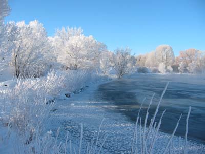
Despite our thermometer hovering at 0 F this morning, the DM and I went for a walk down to Sands Lake. (We had to walk there because our cars are still buried under Thursday's snow, complicated by the efforts of the city snow plows.) I hoped the hoarfrost might be as it was yesterday... only this time I remembered to bring a camera. Beauty, eh?


Saturday, December 24, 2011
Warm wishes from a cold landscape
It's been coooolllllllddddd and snowy here in the Heart of the Rockies! We were graced with a big snowstorm on the winter solstice and sub-zero temps have followed, but we're happy and thankful to have a warm house, supportive community, and each other. (A mug of chocolate and schnapps doesn't hurt, either!)
From the heart of Studio V– Thanks for reading Brush and Baren, for leaving comments insightful to amusing, and for expanding my community of friends and colleagues to many corners of the world. I send sincere wishes for all good things in the year to come... for you, your work, your friends and families, the places you live and the lives you love.
From the heart of Studio V– Thanks for reading Brush and Baren, for leaving comments insightful to amusing, and for expanding my community of friends and colleagues to many corners of the world. I send sincere wishes for all good things in the year to come... for you, your work, your friends and families, the places you live and the lives you love.
 |
| Looking up the Arkansas River from the F Street bridge, Collegiate Peaks and the Continental Divide in the background. |
 |
| Looking back downstream towards the bridge. |
 |
| In the summer this spot on the river has a shallow, sandy eddy we call "the beach." Not so much in December. |
Thursday, December 22, 2011
Paper chase: Laughing Gull linocut
Many long minutes now my fingers have hovered over the keyboard.
I'm waiting. Not for an idea, but for the passing of an idea. I'm trying desperately to resist the urge to continue the bad-relationship metaphor of my previous post. But it's so tempting.
I have, after all, recently released myself from the tyranny of a once-loved-paper-turned-desperado. I am free to shop around... to flirt with all sorts of interesting-looking sheets.... Oh, let's not go there.
A little background for anyone who's just tuning in: For several years I've printed by hand on a domestically-available hand-made sheet called Hosho "Pro." I liked this paper for several reasons:
1) It's bright white,
2) It has both a smooth side and a "felt" side,
3) It comes in a handy size (19 x 24 inches),
4) It's a good thickness for printing by hand
5) It's readily available and
6) It's reasonably priced.
In the last year or so, however, I've started to notice some changes. The paper has been less consistent in thickness, both from sheet to sheet within a batch and from one end to the other of an individual sheet. There have been more brush hairs and other remnants of non-paper "stuff" in the sheets. It has become more difficult to tell smooth surface from felt surface. And the final blow: The paper has been shedding fibers everywhere during printing- soft, linty fibers that gum up ink and rollers and interfere with ink adhesion. In some cases the paper even pulled apart when I peeled it back from the block after burnishing. Not good.
So it's time to find a new "favorite paper." I've ordered a few sheets each of several different papers and for the small (7" x 5") image I'm working on now I'm trying three of them: Rives lightweight, Canson Johannot, and Awagami Kozo.

Two passes down, one light blue solid and then the blended blue roll. Papers, left to right in the image above: Rives Lightweight, Canson Johannot, Awagami Kozo.
The first thing I noticed is that NONE of these papers shed fiber. Thank goodness.
The Johannot's chief appeal is that it's the whitest of the three papers. It is also the thickest and sports the most texture... two features which do not appeal. More on this later.
The third color pass was done during my demonstration at Abend Gallery last weekend, and it's here that things really started to get interesting. All of the papers showed some texture in the first color passes, but look at how little pigment made it on to the Johannot (center), even after three passes. These were all inked and baren-rubbed the same way. In fact, they were printed in the order in which they appear here... so it's not like I started with too little ink on the Johannot sheets. (I even rubbed the Johannot sheets harder than the others, but could only get this light ink transfer.)
The fourth color pass is another gray. More interesting still. The value changes are clear on the Kozo and Johannot... not so much on the Rives. (Far right in the image below.) Hm.
And now the tricky part. Teeny, tiny red bird bills. I hand-inked these by dabbing some pigment on the block. Took no time at all. A half dozen little chips later I was ready for the final black.

All three sheets laid side-by-side again. The Johannot, while interesting, is not a paper I would choose to use very often. The Kozo (left) looks badly wrinkled here... but that's not the paper's fault. I spilled water on the table and didn't notice until after I'd set prints down in it. (sigh) It's good to note, however, that this is probably not a paper that would respond well to damp printing. I always print on dry sheets.

Here is the Johannot (left) side-by-side with the Rives lightweight. I've done the last couple of small prints on the Rives and aside from the fact that it's a warm white I've liked it well enough. Inks seem to be drying much more slowly on it, though. It has a very fine and regular linen-y texture that seems to take ink okay.

But the most intriguing "new" paper is the Awagami Kozo. The paper is a warmer white than I'd like and the texture is a little more pronounced, BUT... this paper seems to love ink. Every pass went down smoothly and with relatively little pressure on the baren. The Kozo is the thinnest of the three papers I compared here, which I am sure contributed to the ease of printing.
For my next piece I'll try the Kozo again. I'm anticipating a larger image, so one of the key questions will be how easy it is to register this thinner paper in a large sheet. The batch I just ordered was shipped in a roll instead of flat, which impacted handling a bit. (Curvy paper requires a little more finesse in the registration jig.) I'm hoping that gravity will do its thing now that I'm storing the remaining sheets flat.
In all, a worthwhile experiment.

One final photo just for grins: All that remained on the block for the final color pass. A reduction print that really lived up to its name.
I'm waiting. Not for an idea, but for the passing of an idea. I'm trying desperately to resist the urge to continue the bad-relationship metaphor of my previous post. But it's so tempting.
I have, after all, recently released myself from the tyranny of a once-loved-paper-turned-desperado. I am free to shop around... to flirt with all sorts of interesting-looking sheets.... Oh, let's not go there.
A little background for anyone who's just tuning in: For several years I've printed by hand on a domestically-available hand-made sheet called Hosho "Pro." I liked this paper for several reasons:
1) It's bright white,
2) It has both a smooth side and a "felt" side,
3) It comes in a handy size (19 x 24 inches),
4) It's a good thickness for printing by hand
5) It's readily available and
6) It's reasonably priced.
In the last year or so, however, I've started to notice some changes. The paper has been less consistent in thickness, both from sheet to sheet within a batch and from one end to the other of an individual sheet. There have been more brush hairs and other remnants of non-paper "stuff" in the sheets. It has become more difficult to tell smooth surface from felt surface. And the final blow: The paper has been shedding fibers everywhere during printing- soft, linty fibers that gum up ink and rollers and interfere with ink adhesion. In some cases the paper even pulled apart when I peeled it back from the block after burnishing. Not good.
So it's time to find a new "favorite paper." I've ordered a few sheets each of several different papers and for the small (7" x 5") image I'm working on now I'm trying three of them: Rives lightweight, Canson Johannot, and Awagami Kozo.

Two passes down, one light blue solid and then the blended blue roll. Papers, left to right in the image above: Rives Lightweight, Canson Johannot, Awagami Kozo.
The first thing I noticed is that NONE of these papers shed fiber. Thank goodness.
The Johannot's chief appeal is that it's the whitest of the three papers. It is also the thickest and sports the most texture... two features which do not appeal. More on this later.
 |
| Sorry, didn't pay attention to order of papers. These are now, left to right, Kozo, Johannot, Rives lightweight. I'll try to be consistent from here on out. |
The third color pass was done during my demonstration at Abend Gallery last weekend, and it's here that things really started to get interesting. All of the papers showed some texture in the first color passes, but look at how little pigment made it on to the Johannot (center), even after three passes. These were all inked and baren-rubbed the same way. In fact, they were printed in the order in which they appear here... so it's not like I started with too little ink on the Johannot sheets. (I even rubbed the Johannot sheets harder than the others, but could only get this light ink transfer.)
 | |||
| Here's a comparison a little closer. Kozo on the left, Johannot on the right. You can also see the difference in paper weights here. The Kozo is much thinner. |
The fourth color pass is another gray. More interesting still. The value changes are clear on the Kozo and Johannot... not so much on the Rives. (Far right in the image below.) Hm.
 |
| Four colors down and the differences in ink adhesion become more pronounced. Left to right: Awagami Kozo, Canson Johannot, Rives Lightweight. |
 |
| Kozo left, Johannot right. |
And now the tricky part. Teeny, tiny red bird bills. I hand-inked these by dabbing some pigment on the block. Took no time at all. A half dozen little chips later I was ready for the final black.

All three sheets laid side-by-side again. The Johannot, while interesting, is not a paper I would choose to use very often. The Kozo (left) looks badly wrinkled here... but that's not the paper's fault. I spilled water on the table and didn't notice until after I'd set prints down in it. (sigh) It's good to note, however, that this is probably not a paper that would respond well to damp printing. I always print on dry sheets.

Here is the Johannot (left) side-by-side with the Rives lightweight. I've done the last couple of small prints on the Rives and aside from the fact that it's a warm white I've liked it well enough. Inks seem to be drying much more slowly on it, though. It has a very fine and regular linen-y texture that seems to take ink okay.

But the most intriguing "new" paper is the Awagami Kozo. The paper is a warmer white than I'd like and the texture is a little more pronounced, BUT... this paper seems to love ink. Every pass went down smoothly and with relatively little pressure on the baren. The Kozo is the thinnest of the three papers I compared here, which I am sure contributed to the ease of printing.
For my next piece I'll try the Kozo again. I'm anticipating a larger image, so one of the key questions will be how easy it is to register this thinner paper in a large sheet. The batch I just ordered was shipped in a roll instead of flat, which impacted handling a bit. (Curvy paper requires a little more finesse in the registration jig.) I'm hoping that gravity will do its thing now that I'm storing the remaining sheets flat.
In all, a worthwhile experiment.

One final photo just for grins: All that remained on the block for the final color pass. A reduction print that really lived up to its name.
Tuesday, December 20, 2011
Until you've had enough, you haven't had enough
I suspect most of us have been, at one time or another, in relationships that should have ended a very long time before they actually did. We want them to work out. We exaggerate the good aspects, turn a blind eye to all the "little things" and slog forward despite evidence of impending doom. We've made promises, dammit, and we're going to keep them.
So despite mounting troubles with disintegrating paper, clumping inks, outrageous dry times, and physically punishing hours with baren and spoon I naturally kept working on a print that probably should have been scrapped at color #2, not #13. You know how it is: you keep hoping that the next action will be the one to sort out all the problems and salvage the relationship.
But even the most starry-eyed romantic must eventually abandon a love affair that's good for no one. As a wise friend once said, "When you've had enough, you've had enough. But until you've had enough, you haven't had enough."
Here's where the piece was two weeks ago, when apparently I still hadn't had enough:

I liked the dark blue color in the piece on the left, but it didn't define the still-nebulous shapes as I had hoped it would. One more carving and printing would be required. I lightened the blue for the piece on the right. The result seemed too intense, but I intended for most of it to be covered up by the last color, so I was hopeful that it would "tone down." (Read: I had reached the grasping-at-straws stage.)
You can't tell in this photo, but the biggest problem was that all prints had reached what another printmaking friend calls the "Naugahyde" stage: The inks were bumpy and shiny and uneven and just ugly. (Not to mention full of paper fibers.) I don't mind a little of that sort of thing here and there, but over the entire piece? Not attractive. And putting the last color down didn't help things at all... in the end I had a clunky, non-cohesive image with really bad ink coverage. My frog was not a prince. It wasn't even a frog. It was a zombie mutant slime mold. (With apologies to all lovers of slime mold. I know you're out there.)
(sigh)
Like many relationships-gone-bad, there are a few things about this image that I still like (mostly on the right side)... so who knows? You may see portions of this torn down and used for something else, but for now it's a candidate for the ritual Burning of Bad Art. (Yes, there is such a thing. At a friend's studio on the solstice.)
Denial overcome, it's time to move on. The good news is that I'm already learning some interesting things from the new papers this debacle forced me to try. In fact, there's one that's starting to look particularly handsome... Queue the violins and tune in next time. This could be the start of something wonderful.
So despite mounting troubles with disintegrating paper, clumping inks, outrageous dry times, and physically punishing hours with baren and spoon I naturally kept working on a print that probably should have been scrapped at color #2, not #13. You know how it is: you keep hoping that the next action will be the one to sort out all the problems and salvage the relationship.
But even the most starry-eyed romantic must eventually abandon a love affair that's good for no one. As a wise friend once said, "When you've had enough, you've had enough. But until you've had enough, you haven't had enough."
Here's where the piece was two weeks ago, when apparently I still hadn't had enough:

I liked the dark blue color in the piece on the left, but it didn't define the still-nebulous shapes as I had hoped it would. One more carving and printing would be required. I lightened the blue for the piece on the right. The result seemed too intense, but I intended for most of it to be covered up by the last color, so I was hopeful that it would "tone down." (Read: I had reached the grasping-at-straws stage.)
You can't tell in this photo, but the biggest problem was that all prints had reached what another printmaking friend calls the "Naugahyde" stage: The inks were bumpy and shiny and uneven and just ugly. (Not to mention full of paper fibers.) I don't mind a little of that sort of thing here and there, but over the entire piece? Not attractive. And putting the last color down didn't help things at all... in the end I had a clunky, non-cohesive image with really bad ink coverage. My frog was not a prince. It wasn't even a frog. It was a zombie mutant slime mold. (With apologies to all lovers of slime mold. I know you're out there.)
(sigh)
 |
| In the few places where the final dark adhered... not so bad, but those places were very few. |
Denial overcome, it's time to move on. The good news is that I'm already learning some interesting things from the new papers this debacle forced me to try. In fact, there's one that's starting to look particularly handsome... Queue the violins and tune in next time. This could be the start of something wonderful.
Monday, December 19, 2011
Five Questions/Five Artworks in Wildlife Art Journal
One of the most rewarding aspects of my rather haphazard journey as an artist has been friendships with fabulous artists around the world.
 French artist Denis Clavreul and I have been friends since the first time we were both juried in to Birds in Art at the Woodson Art Museum in 1991, and we've worked and traveled together on both sides of the Atlantic many times since then. Imagine my delight when Denis asked to interview me for Wildlife Art Journal's ongoing series "Five Questions/Five Artworks" ! For me, it's a great celebration of 20 years... and of still finding new things to talk about with old friends.
The article went live this evening... Many thanks to editor Todd Wilkinson for the opportunity, and to Denis for giving me lots of food for thought. And a few kicks in the behind when I needed them.
 | |
| Old friends already. France 1999. That's Denis on the right. The angelic figure in the center is Dutch/Australian artist Robin D'Arcy Shillcock. Whodathunk it would come to this? |
Friday, December 16, 2011
Linocut demo tomorrow in Denver!
 |
| It's a bird! No... it's a bunch of birds! |
The high country weather gods appear to be smiling on the roads between here and Denver, so first thing tomorrow morning I'll be heading down to the Mile High City to present an informal printmaking demonstration.
There are a dozen of us on the schedule from 11-3 at Abend Gallery, Colfax and York streets. I started a new little project to work on tomorrow, my plan is to do both the carving and printing of the next color during the day. Come by and say hi!
Wednesday, December 14, 2011
"Usurper" in the house...
I considered breaking this up into three posts... both to create a prolonged dramatic ending and, honestly, to have a few posts in the queue to carry me through the distracting end-of-year chaos ahead. But the Problem Child print is STILL a problem... STILL not dry enough for the last ink layer... so there are enough delays around here already. Let's finish this little piece, shall we?

I shouldn't have worried that the previous pass was too dark, as this dark green went down on top of it and still left room for more.

Which I obligingly added. I could have stopped at this point, but you know me. "Just one more color" is the usual mantra around here. I finished this linocut with a dark brown... although I think it looks black in the photo.
Along my "usual" walking route are several nest boxes intended for use by mountain bluebirds. Early each spring I see bluebirds popping in and out of almost all of them, but a few weeks later the tree swallows arrive and displace a few pairs.
I mutter "usurpers" at the assertive tree swallows and chastise the bluebirds for not holding their ground, but secretly I admire the spunk of swallows. From the moment the last one departs in the autumn I am waiting, waiting, waiting for their return.
I shouldn't have worried that the previous pass was too dark, as this dark green went down on top of it and still left room for more.
Which I obligingly added. I could have stopped at this point, but you know me. "Just one more color" is the usual mantra around here. I finished this linocut with a dark brown... although I think it looks black in the photo.
 |
| "Usurper," reduction linocut, 7 x 5 inches. Edition TBD. |
Along my "usual" walking route are several nest boxes intended for use by mountain bluebirds. Early each spring I see bluebirds popping in and out of almost all of them, but a few weeks later the tree swallows arrive and displace a few pairs.
I mutter "usurpers" at the assertive tree swallows and chastise the bluebirds for not holding their ground, but secretly I admire the spunk of swallows. From the moment the last one departs in the autumn I am waiting, waiting, waiting for their return.
Monday, December 12, 2011
Delight by post
 |
| Some embiggification is possible with clicking. |
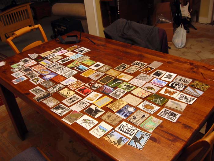
For the last several days folks on the Barenforum listserv have been gleefully announcing the arrival of prints from the most recent exchange. Perhaps you remember this project... 101 prints just 3.2 x 3.5 inches in size, sent off to a brave coordinator to be collated and returned as a set of 100 unique images.
"Wonderful!" the other participants exclaimed. "Beautiful, fascinating..." and all other sorts of superlatives.
But my mailbox remained empty and all I could exclaim was, "But where are mine?" (Pout. Pout.)
Today, however, I finally joined the ranks of happy exchangers. The long-anticipated parcel arrived, and in it was a lovely custom-made box, crafted for each exchange participant by our intrepid coordinator, Gayle Wohlken. (Above and beyond the call of duty, methinks.)
Within the ribbon-tied box (which you can just make out in the upper corner of the table in the photo above) was the most delightful assortment of woodcuts... single-color to bazillion-color, printed on everything from the most delicate translucent sheets to glossy cardstock. Every single one is charming, and the variety is utterly inspiring. It was all I could do to keep from running straight out to the studio after I spread them all out on the dining table. (Actually, I apologize that there are a few not pictured here. I didn't realize until I was scooping them all up again that some had stuck together.)
A few of these prints I watched evolve on the blogs of my virtual printmaker-friends, and it's wonderful to pick up the real thing. From your hands to mine... thank you.
I am SO glad I decided to participate in this celebration of prints and printmaker camaraderie. I shall certainly do it again. Eventually. ;-)
Friday, December 9, 2011
One step forward, two long delays
It's been an interesting couple of days around here. And by interesting I mean simultaneously exciting and dreary. I finally bit the bullet and launched myself into computer upgrade purgatory... pushed the "purchase" button at Apple on Monday, and got the new machine yesterday.
An iMac is, of course, a thing of beauty, but OOPH. I've put off the upgrade for too long because of the inevitable cascade of compatibility headaches. I was three (count 'em, three) operating systems out of date... stepping up just two of them rendered a printer, a scanner, and a hugely expensive chunk of software obsolete. (sigh)
So for two days I've been doing file transfer and triage, and I'm mostly functional for now. (I've got 30 days before my big, fat chunk of trial software is gonna need a cash infusion.)
Tonight I finally felt satisfied that I could walk away from it, so dashed up to the studio to see where things stand with the two prints in progress.
My Problem Child is still a problem: the eucalyptus leaves lino is too, too wet to apply that last layer of ink, so there it sits.
The little swallow linocut is faring better, however. Wednesday, BCU (Before Computer Upgrade) I added another color layer to what you may or may not have figured out is a nest box. I did this using a mask, which I actually remembered to photograph this time.
Tonight I took a deep breath and started to do something with the background of this piece. I'm a little afraid that I've gone too dark here, but maybe not. I'm going to print out a couple of copies of this photo and get out the colored pencils and see if I can decide what to do next before I start hacking away at the block again.

In addition to my new iMac, the delivery guys brought my "two sheets of this, two sheets of that" potential-replacement-for-favorite print papers this week. Heh. Why do I feel like I'm being required to upgrade multiple aspects of my life simultaneously?
An iMac is, of course, a thing of beauty, but OOPH. I've put off the upgrade for too long because of the inevitable cascade of compatibility headaches. I was three (count 'em, three) operating systems out of date... stepping up just two of them rendered a printer, a scanner, and a hugely expensive chunk of software obsolete. (sigh)
So for two days I've been doing file transfer and triage, and I'm mostly functional for now. (I've got 30 days before my big, fat chunk of trial software is gonna need a cash infusion.)
Tonight I finally felt satisfied that I could walk away from it, so dashed up to the studio to see where things stand with the two prints in progress.
My Problem Child is still a problem: the eucalyptus leaves lino is too, too wet to apply that last layer of ink, so there it sits.
The little swallow linocut is faring better, however. Wednesday, BCU (Before Computer Upgrade) I added another color layer to what you may or may not have figured out is a nest box. I did this using a mask, which I actually remembered to photograph this time.
 |
| A tracing paper mask lets me ink only the area of the nest box and not the entire block. |
 |
| Nifty, eh? |

In addition to my new iMac, the delivery guys brought my "two sheets of this, two sheets of that" potential-replacement-for-favorite print papers this week. Heh. Why do I feel like I'm being required to upgrade multiple aspects of my life simultaneously?
Tuesday, December 6, 2011
Gratuitous bid to distract readers from the other piece in progress
The second-to-last color went down on the epic eucalyptus-leaves-and-other-washed-up-stuff linocut today, but I think I'm going to save the reveal until the piece is completely resolved. It looks pretty funky at the moment.
In the meantime, here's another print I've been working on. It's just 5 x 7 inches (the "currently funky" piece is 9 x 12) and I'm printing it on Rives lightweight... not the problematic Hosho.
The first three passes were pretty uninteresting, so you didn't see them individually. The VERY first pass was white... which might seem odd. But the Rives lightweight is a creamy color and the image called for a section that was pretty darn white, so I cut a mask and printed a small area. I also masked the green shape, since it was limited to just this rectangular area of the image. Over both went a transparent blue. You can barely see any of it here.
Next, a transparent ochre-to-gray blend.
And then a transparent purple-blue.
What? You don't think it was purple? Here's the color scraped into a sheet of wax paper, next to the same color inked up on the block. I did say it was transparent.

I was feeling really good about things so far... nice, quiet, harmonious colors. That all went a little wacky with the next selected inking.
It seems a bit harsh, but most of this blue will be covered up by other colors.
After the agony of the larger piece, I am really enjoying this one. Inks are doing what I want them to do, the paper isn't throwing fluff everywhere, I'm able to do all the printing with my baren and not having to resort to rubbing extra hard with the spoon. There are six passes here already and I'm cruising right along.
Of course, I haven't really given ANY thought to what's going to happen in the background of this piece. I think that's next. Or maybe the box and then the background and then the bird. Dunno. At least four more passes either way.
In the meantime, here's another print I've been working on. It's just 5 x 7 inches (the "currently funky" piece is 9 x 12) and I'm printing it on Rives lightweight... not the problematic Hosho.
The first three passes were pretty uninteresting, so you didn't see them individually. The VERY first pass was white... which might seem odd. But the Rives lightweight is a creamy color and the image called for a section that was pretty darn white, so I cut a mask and printed a small area. I also masked the green shape, since it was limited to just this rectangular area of the image. Over both went a transparent blue. You can barely see any of it here.
 |
| Color passes 1, 2, and 3 |
Next, a transparent ochre-to-gray blend.
 |
| Pass #4 is a blended roll |
And then a transparent purple-blue.
 |
| Pass # 5 |
What? You don't think it was purple? Here's the color scraped into a sheet of wax paper, next to the same color inked up on the block. I did say it was transparent.

I was feeling really good about things so far... nice, quiet, harmonious colors. That all went a little wacky with the next selected inking.
 |
| Pass # 6 |
It seems a bit harsh, but most of this blue will be covered up by other colors.
After the agony of the larger piece, I am really enjoying this one. Inks are doing what I want them to do, the paper isn't throwing fluff everywhere, I'm able to do all the printing with my baren and not having to resort to rubbing extra hard with the spoon. There are six passes here already and I'm cruising right along.
Of course, I haven't really given ANY thought to what's going to happen in the background of this piece. I think that's next. Or maybe the box and then the background and then the bird. Dunno. At least four more passes either way.
Friday, December 2, 2011
The uphill battle for Underfoot prints
Print progress updates have been a little slim around here lately, but it's not because there's no printing going on. Quite the opposite, in fact. I've put three client projects (not printmaking) to bed in the past week (one of them a 5x17-FOOT mural, eek!) and have happily filled the "extra" time with trips to Studio V.
Unfortunately, printing problems have persisted, and my up-to-now favorite paper seems to have finally gone 'round the bend.
The last few batches of Hosho "pro" that I've purchased have been noticeably inconsistent in thickness... even from one end of a sheet to the other. I've grumbled, but worked with it. But remember the troubles I was having with the ibis linocut from a couple of weeks ago? Some of my troubles were due to impatience and too-wet ink, but something still wasn't right.
I used Hosho AND Rives lightweight for the little aspen leaf print, and noticed again a little "fibre pulling" on the Hosho. But I made only 5 prints on small sheets of paper and it didn't seem too bad. I chalked the ibis print problems up to printmaker error and launched the current print for the "Underfoot" series on Hosho. (Justification: I have a stack of it, the rest of the series has been done on this paper, and I really like a bright white sheet.)
But there was trouble from the outset. Used to be it was easy to tell the smooth side from the felt side on this paper. This batch, not so much. It's ALL fuzzy. As a result, the first color pass was... how shall I describe it? Not smooth. No problem, I thought. The first passes are often light, and once there's another layer of ink on there, the felty bits will lay down and it will be just fine.
Hmm. Nope.
By the fourth pass I was really getting worried, but I was committed by then. I can't abandon a project if there's any chance I can pull it off. (Can you say obsessive/compulsive?) I like this image and I like the carving and I know that I'll probably never revisit it... so I soldiered on.
But what a mess! The paper is blowing fibers EVERYWHERE! Somewhere around color 4 or 5 I had to clean off the block and scrape my inking slab every other sheet because everything was getting gummed up with tiny paper fibers. Not. Right.
I whined about it to a friend who teaches in a college printmaking department and she shook her head. She'd heard other printmakers were having trouble with this paper, too. (When using it on a press someone had big sections of paper pulling OFF. Yikes!)
(sigh)
So I've carried on...but at this point it's taking about 15 minutes to hand-burnish each sheet, and the adhesion is still spotty. It looks okay from a distance, but up close? Hm. At this point I just need two more colors, and I'm hoping they'll provide at least a couple of usable prints.
Of course the upshot of all this is that I got to participate in Cyber Monday by ordering some new papers to experiment with. Two sheets of this, two sheets of that....
I also started another small (5x7) print on Rives lightweight... just to keep myself from completely throwing in the towel. Nothing to show for it yet... but I bet next week there will be!
In the meantime, I just scheduled a demo at Abend Gallery in Denver for Saturday, December 17. I'll be surrounded by painters during the session... so come and show some printmaker love if you're in the 'hood! 11am-3pm. Might be a good time to see if I have any hair left, too.
Unfortunately, printing problems have persisted, and my up-to-now favorite paper seems to have finally gone 'round the bend.
The last few batches of Hosho "pro" that I've purchased have been noticeably inconsistent in thickness... even from one end of a sheet to the other. I've grumbled, but worked with it. But remember the troubles I was having with the ibis linocut from a couple of weeks ago? Some of my troubles were due to impatience and too-wet ink, but something still wasn't right.
I used Hosho AND Rives lightweight for the little aspen leaf print, and noticed again a little "fibre pulling" on the Hosho. But I made only 5 prints on small sheets of paper and it didn't seem too bad. I chalked the ibis print problems up to printmaker error and launched the current print for the "Underfoot" series on Hosho. (Justification: I have a stack of it, the rest of the series has been done on this paper, and I really like a bright white sheet.)
But there was trouble from the outset. Used to be it was easy to tell the smooth side from the felt side on this paper. This batch, not so much. It's ALL fuzzy. As a result, the first color pass was... how shall I describe it? Not smooth. No problem, I thought. The first passes are often light, and once there's another layer of ink on there, the felty bits will lay down and it will be just fine.
 |
| Four colors down. Spotty at best. |
Hmm. Nope.
By the fourth pass I was really getting worried, but I was committed by then. I can't abandon a project if there's any chance I can pull it off. (Can you say obsessive/compulsive?) I like this image and I like the carving and I know that I'll probably never revisit it... so I soldiered on.
But what a mess! The paper is blowing fibers EVERYWHERE! Somewhere around color 4 or 5 I had to clean off the block and scrape my inking slab every other sheet because everything was getting gummed up with tiny paper fibers. Not. Right.
 |
| Selective inking for colors... hmm... 6, 7, 8, I think. |
(sigh)
 |
| Colors... 9, 10, 11(?) down. Printmaker sustained hand-cramp injury from too much burnishing time. |
So I've carried on...but at this point it's taking about 15 minutes to hand-burnish each sheet, and the adhesion is still spotty. It looks okay from a distance, but up close? Hm. At this point I just need two more colors, and I'm hoping they'll provide at least a couple of usable prints.
Of course the upshot of all this is that I got to participate in Cyber Monday by ordering some new papers to experiment with. Two sheets of this, two sheets of that....
I also started another small (5x7) print on Rives lightweight... just to keep myself from completely throwing in the towel. Nothing to show for it yet... but I bet next week there will be!
In the meantime, I just scheduled a demo at Abend Gallery in Denver for Saturday, December 17. I'll be surrounded by painters during the session... so come and show some printmaker love if you're in the 'hood! 11am-3pm. Might be a good time to see if I have any hair left, too.
Monday, November 28, 2011
Exhibition Update
I expect you're all chomping at the bit to know where you might find original linocuts during the month of December. Let me help you with that!
 This Thursday, December 1, I'll be hanging work at the Salida Café in... Salida, of course. Grab a latte and gape at linos. There will be a few brand-new, only-ever-seen-on-Brush-and-Baren pieces in the mix. Show runs through the month of December.
300 Sackett Street, down by the river.
 This Friday, December 2, the 21st Annual Miniatures Show opens at Abend Gallery in Denver. There will be hundreds of small works (really!) available for cash-and-carry holiday shopping, including 6 of my linocuts.
Show runs through January 7, 2012.
2260 E. Colfax (Colfax and York), Denver.
 And, of COURSE, you can always find my work at the Maverick Potter in historic downtown Salida. The brand-newest piece from last week will be there!
(And if you're lucky you might even get to meet the brand-newest member of the MP family, not-quite-two-month-old Thor!)
119 F Street, Salida
300 Sackett Street, down by the river.
Show runs through January 7, 2012.
2260 E. Colfax (Colfax and York), Denver.
(And if you're lucky you might even get to meet the brand-newest member of the MP family, not-quite-two-month-old Thor!)
119 F Street, Salida
Sunday, November 27, 2011
Prints and camaraderie in the mail
 |
| (Hey, Jill.. I pinched this pic from your blog.) |
My contribution in place, I shipped the book off to Amie Roman of Burnishings. Seems to me my timing might have been a little dodgy, since I think I sent it around the time Amie had her baby! She already had her hands full with a new project of her own.
But some time later I had a message from Amie that she'd added her own piece and moved the project along to another printmaker. Gratified that it was off to a good start, I promptly put that little book out of my mind.
So imagine my surprise and delight (and Jill's!) when I learned that the tiny book did indeed make it back home, full of wonderful prints! Jill tells the story and includes photos of all the images in her celebratory post here.

It's a story with a happy ending, but it also has a delightful postscript. This week I received another envelope from Jill... this time it included something that I'm not mailing anywhere. Ever.
It's a beaut, ain't it? A Jill Bergman original that makes me smile and reminds me that printmakers the world over are a wonderful bunch. Thanks, Jill, for initiating the project and thanks to everyone who played along.
Sunday, November 20, 2011
Autumn leaves... outside the box
Well, the waiting is finally over. Sort of. The wait now is for this piece to dry enough to frame, hopefully by the end of this week. There are holiday shows to hang, and SOON, afterall.
Here's how the end game played out:

After the blue, a gray. This was one of those nervous moments when I wondered if I had made the right color choice.

But the final dark made it all happy again... whew!
I definitely like this boundary-breaking approach... I'll have to keep my eyes open for other images that would work well.

In the meantime, I'm moving forward on the new piece for the Underfoot series. Three colors are down... the three easiest ones to figure out. I think I have the next color sorted out in my head... but in the meantime I'm spending an awful long time carving with only a tiny pile of linoleum chips to show for it.

Seriously. Whose idea was it to carve all these little, tiny shapes? She should be reprimanded severely. Or at least denied dessert.
Thursday, November 17, 2011
Things to do whilst waiting for ink to dry

In the ongoing list of things to do whilst waiting to proceed with prints in progress*:
# 12) Package up one's contribution to the Monumental Collaborative Puzzle Print project so that tomorrow one can
# 13) Take it to the post office.
All the gory details for Maria Arango's demonstration of
The project theme is "City of the World." I'm pretty sure that my block fits "behind" a house-shaped piece and "in front" of a skyscraper-shaped piece.. which made me think of an alleyway. Cities large and small have all sorts of creatures (also large and small) frequenting their alleys, especially at night.
Who-who-who goes there?
I had never carved cherry before, and I have to say I quite liked it. There are a couple of spots on this block where the carving went too deep... blame it on poorly sharpened tools and brief lapses of attention on the part of the carver. I just hope it prints okay... we're not to do test prints for risk of warping the blocks before they are returned to their mothership. Ummm, motherboard. Ummm, proper place in the puzzle.
(*What? You didn't see list items #1-11? Let's just say some things are best kept to oneself. Like laundry. And dishes. And whining.)
Subscribe to:
Posts (Atom)
Linocut in Progress: The Third Act
Time to wrap up this linocut ! And we are wrapping at warp speed (see what I did there?)... because there are deadlines. Exhibition deadline...

-
 "The Linocut Jig." Sounds like it should be a piece of contemporary Celtic music, eh? As promised, some pix and descriptions of m...
 -
 I've written a couple of times about my funky little DIY print drying rack, but there's been some interest in it again so I thought ...