Tuesday, February 28, 2012

Slippershod (not slipshod) work

It's a little frustrating to look out my studio windows into swirling snow when friends elsewhere are posting images of blooming daffodils and greening grass. Such is the way of spring in the high country. (sigh)

But these are the sorts of days in which I am grateful that both the DM and I can work at home. A cup of tea and my slippers are all I really need to get down to business.

This morning it's the business of contemplation. The goldeneye piece ("No Time Like the Present") has been waiting patiently for resolution, and the new piece I'm working on has reached the inevitable "What next?" stage. Decision-making time looms.

I messed around with additional colors in the figure of the goldeneye but didn't like the result... today I think I'll try a few additions in the water and see what happens. Ultimately I think the piece will probably stand as is, but I need to satisfy myself that I've explored other possibilities.


Meanwhile, the new linocut in progress is also of waterfowl. I'm feeling superstitious about showing much, despite the fact the piece is at least ten colors along! I am pleased with the way the birds have developed, but the rest of it is a big question mark. For now all you get are the first two colors, applied again with the use of a stencil (yeah, I've been diggin' this stencil business).

So I'm off to stare at blocks and prints and tools as I search for the next steps in both of these images. If you hear a cry of "Eureka!" and see some ratty slippers tossed into the air, you'll know I've found what I'm looking for.

************

Update: I added one more color to the top edge of the goldeneye piece today. I struggle to get a good shot of blues with a digital camera, but here's the final version of "No Time Like the Present."


Tuesday, February 21, 2012

Finished? Or not.

Once the reflection was resolved (or so I thought), it was time to address the duck. This was all pretty straightforward and didn't take long, since very little carving was required to free Mr. Goldeneye from any entanglements with with rest of the image.

First some light purple in his head for a few highlights. Male goldeneye are black and white, but their feathers have an iridescent quality in the light.


The reflection of the duck in the water needs to be slightly off-color and value from the actual critter, so I tackled that with a brownish color.


A little bit more carving, and then the black.


Here's a close-up of the duck.


But there's a dilemma. Now that the duck is finished, the piece just doesn't seem to have the WOW factor that I saw in my head. It's a nice print, but does it make you go "ooooooh"?

My initial idea was to celebrate the abstract quality of the water reflection. The on-the-fly decision to add the woodgrain was exciting, but I don't know if it confused the concept.

The good news is that both blocks are still largely intact. I could potentially put one more darkish color in the reflection and see if that brings little more oomph to the image. I think there are 18 good prints to work with, so I could spare a couple as experiments.

I think it was Leonardo da Vinci who said "Art is never finished, only abandoned." For now I'll just sit with this piece for a couple of days and see if satisfaction grows.

In the meantime... yeah. I started another one.

Embiggenable version, if you'd like to contemplate solutions with me.
Or maybe you like it just the way it is....

Monday, February 20, 2012

Drama unfolds for the goldeneye


After the wood grain texture and the blue tones were sorted out it was finally time to remove a large amount of material from the linoleum block.

And then it was time to chew my fingernails a bit. What the heck color should go on next? I knew I wanted to suggest reflected trees, so green seemed logical. But how much green and what value? After a lot of hemming and hawing and mixing and remixing I settled on this sort of mid-value, warmish green and dove on in.


Holy mackerel! Did this thing suddenly take on a life of its own, or what? I got so excited at this point that I made the DM come in and admire the prints on the drying rack probably a dozen times. That night I barely slept.

And then, by the cold light of a new day, I realized I was stuck. What now? The reflection needed some more interest, but how to achieve that? The reference photo I looked at for the water pattern was just a flat dark, almost black, and not what I wanted. I carved a little bit more out of the reflection shapes and tried printing a brownish green. Ick.

How about a greener green? Also ick. Mostly boring.

Okay. How about another blend?


Freakin' gorgeous on the block, and none too shabby on paper. (Although this photo is way too warm, the paper is actually white, not cream.)


All that remains is the duck. I think.

Saturday, February 18, 2012

Carrying on with the goldeneye print


After the light blue background step shown in the last post, I felt a need for something more.... interesting... in this print. Clearly this is going to be a duck-on-water sort of thing. It needs something special. Like, I dunno.... texture, maybe. Perhaps something like wood grain.

Yeah. Wood grain.

Off I went to see Ves, the carpenter at our neighborhood lumberyard, lino block under one arm and one of the prints under the other. He understood immediately what I was after, and reached straight into the scrap bin for a gorgeous piece of oak-veneer plywood. The grain fell in exactly the right place. It was meant to be, so Ves trimmed the oak board to the dimensions of my linoleum block and I toddled back to the studio with two boards under my arm.

The oak was pretty tough to carve, so I was glad I didn't need to do much detail. I just cleared out the space for the duck and its reflection and was ready to go. I used three small rollers (as opposed to the single large roller, which I had already returned to its owner) to produce a blend and printed away.

You saw a corner of it at that stage.


I liked the grain but it was a bit too pronounced for where this image is headed, so I inked up the lino block with a transparent medium blue and printed that over the entire print again. Got that? Solid from the lino, blend from the wood, solid from the lino again. The difference was subtle, but I think it was the right decision.


Just look at where that wood grain falls around the duck, will ya?

After this it was back to the lino block for some serious carving.

Thursday, February 16, 2012

Here we go...

Today's marathon printing session was successful enough that I think we're out of the "this could all fall apart at any moment" stages of the current print-in-progress. In other words, I feel like it's finally "safe" to take a bit of the mystery out of what's been going on in the studio.

This piece is the largest one I've worked on in a while: 12" x 18" (about 36 x 44cm), but the first stages were quite small. And they sort of blew the "surprise" aspect of a reduction print by giving away the main subject right away.

Yup. These are ducks. In a row.

Ah, but you might be wondering why, if this is a 12 x 18 print and I usually work using the reduction process, there is so much white paper showing in these first stages. Quite clever and observant you are!

The answer is that I didn't want to build up too much ink too quickly in the background. Transparency and luminosity are key to the overall image, so I wanted to leave the white of the paper as long as possible. Enter the stencil!


I carved the white bits of the duck (male common goldeneye, if you want to know) out of the lino block, then cut a mylar stencil for inking the overall shape of the bird and its reflection. I printed the lightest blue (shown above) over all the sheets, then carved a bit more out of the bird and reflection and printed the second blue.

(Sorry it's crooked. The other shots I took at this stage were really blurry.)
The next question was how to handle the eyes which, as you might have guessed in a bird called "goldeneye," are yellow.

I cut another stencil, but since the areas to be yellow and ochre were so small, I didn't see much point in inking the block, registering the paper, and rubbing the print. For this stage I employed a little pochoir technique... "pouncing" the color directly on to each print by hand with a stiff brush.


At this point I was finally ready to get on with the rest of the image, but things got a little bumpy. I  envisioned a blended roll from top to bottom of the entire block, but I had trouble getting my blend to work smoothly over such a large area. I had borrowed a 16-inch-wide roller from a friend, but I didn't have a big enough space to get a good ink roll-out AND the block has some low spots in it that didn't take the ink well from the big roller. (I did sand the block before I started, but apparently it wasn't enough.)


So I bagged the idea of a blend at this stage and instead printed a solid light blue.


Duck with googly eyes and pale blue background. So far, so good.

Wednesday, February 15, 2012

Come with me to Hog Island Audubon Camp in Maine!


We interrupt our regularly scheduled drawing and printmaking babble to bring you a little workshop promotion love fest.

If you were a Brush and Baren reader last summer, you know what a fabulous time I had as an instructor at Hog Island Audubon Camp. This little island has a long history of conservation education... with an honor roll of session leaders that includes Roger Tory Peterson and Rachel Carson. From the Hog Island website:

Since 1936, residential sessions at Hog Island have been led by some of the most respected naturalists and environmental educators in the nation, inspiring scores of scientists, school and university educators, and conservation leaders.
Hog Island BridgeRoger Tory Peterson, inventor of the modern field guide, was among the first teachers at the camp in 1936, where his experiences helped him ignite popular bird watching in the United States.
Rachel Carson, a great force behind the modern environmental movement, visited Hog Island in 1960 and mentioned it in her landmark book Silent Spring.
Dr. Stephen W. Kress, a Hog Island ornithology instructor in the 1970’s founded Project Puffin, the seabird restoration program that is recognized internationally for the pioneering work that brought puffins and terns back to their historic nesting islands on the Maine coast.
Kenn Kaufman, international birding authority, author, and educator, was only nine years old when he read Peterson’s account of time spent at Hog Island. Now Kaufman is one of the Camp’s frequent instructors.

I'm pretty sure I mentioned a while back that I'll be returning this July to share in the fun as an instructor for Sharing Nature: An Educator's Week, but I'd like to tell everyone about it again in case you missed it. We'll be exploring the intertidal zone, rambling through the Maine woods, gawking at Atlantic puffins, and learning so many ways to share nature with others that we risk brain implosion. We'll be hands-on with art, music, and science, and bellies-on with great camp meals. If you know an educator (classroom teacher, nature center docent, homeschool parent), don't you think they deserve a week away at camp?

Need a little bit more incentive? There are scholarships available through the National Audubon Society, up to $500(!)... via an online application here. (The first listing under "All Sessions.") There are other funds available through local Audubon chapters... contact your local organization if you don't see it listed on the scholarship page, and let them know there are matching funds available for their contributions. The deadline for scholarships is coming up soon... so don't dawdle!

If you're not an educator there are plenty of other sessions to choose from... from Family Camp to Field Ornithology. A week on Hog Island is like no other. Why not come see for yourself?

Saturday, February 11, 2012

In case you were wondering

There IS printmaking going on here. I'm just keeping it to myself for a bit. Things are a tad... um... experimental... and I don't want to get anyone's hopes up. (Including mine.)

But I can show you one of the things I'm excited about with this one.


Tantalizing, isn't it?

Friday, February 10, 2012

We have a winner!

I assigned the numbers 1-9 to the comments on the Celebration post and gave them to the Random Number Generator at random.org. The RNG picked 8, which belongs to long-time reader and Canuck in haggis country Jennifer Rose Rhillip! Hooray! Jennifer, pop me an email at sy (at) sherrieyork.com and let me know where you'd like your print shipped. (And which color scheme you'd like... they're shown in my Etsy store.)

Wednesday, February 8, 2012

Road Work Wednesday

Okay, this is not the section I was driving through today, but you get the idea.
This image is from farther downriver, in the Royal Gorge.
In July. I didn't
have a camera with me today.

Never fear, there's still time to leave a comment on Monday's post and be entered in the celebratory giveaway. But we do not rest on our laurels here at Brush and Baren. There is work to be done, by golly.

First on the list was to return a piece of equipment to a friend in Colorado Springs. It's a long way to drive (2 hours each way) just to return something, so my original plan included time to draw at the zoo there.

Plan A: Make the trip last Friday. But last Thursday the weather forecasters were all predicting snowpocalypse, so I decided it could wait. In the end we got diddly squat for snow between here and the Springs. Denver (another hour beyond) got almost 2 feet.

No problem. I had Plan B: Make the trip Monday. No precipitation in the forecast for the entire week. Perfect.

So why, when I woke up Monday morning, was the ground completely white and the sky filled with snowflakes? What the....!@#?!?! (Grumble grumble grumble.)

By yesterday morning we had probably six inches of the white stuff on the ground here, and there was snow in the forecast again for tonight, but DANG it, I had to make this run. So off I went this morning, fingers crossed for good roads.

Aside from a few icy spots in the canyon and some thin fog and wet roads on the Front Range, the journey was uneventful and even completely snow-free in areas. Still, I didn't feel right about dilly-dallying when travel has been so unpredictable, so instead of going to the zoo, I opted to turn right around for home and make some stops in the canyon along the way.

"The canyon" is Bighorn Sheep Canyon, through which flows the Arkansas River. It's a popular stretch for whitewater rafting, and if Christo's proposed "Over the River" project gets approved it will also be the site of that installation. Most of my trips through the canyon are just that: through the canyon en route to somewhere else. It was nice to take my time today and enjoy the view.


Monday, February 6, 2012

Celebrations Everywhere!

Somehow, without fanfare and without any particular attention on my part, Brush and Baren made it to five years of publication (in December) and 700 posts (today!). A lot has happened since December 2006: I shifted house (twice), shifted my studio (twice with the house and recently out and back), added a Darling Man to the household, traveled to both US coasts and stumbled along local paths. My work and the blog have evolved and continue to do so. It's been, as they say, a great ride.

Right about the time Brush and Baren was quietly turning five, Katherine Tyrrell at Marking a Mark was quietly tallying votes for her annual Making a Mark Awards. Among her many insightful categories is "Getting Out of the Studio," honoring artists whose work involves, well, getting out of the studio!

Within this category is the Going Greener Gong, awarded to the art blog deemed "most stimulating in relation to getting us in touch with nature and the environment." Roll a drum and bang that gong, Brush and Baren took the prize! To show my delight and blushing appreciation, I get to sport this lovely little badge all year long. I thought about having it embroidered on the lapels of all my jackets, but in the blogosphere no one can see you dressed. I'll stick with the badge.

Thank you, Katherine! And if you haven't ever visited Making a Mark, I encourage you to do so. Long among the top-rated art blogs originating in the UK, Katherine provides myriad resources and inspiration for artists and art-lovers around the globe.

A blogoversary, an award, and a postiversary all in the first 5 weeks of the new year? It's the blog equivalent of the rockstar lifestyle. Look... I even have to deal with paparazzi!

Oh wait, that's just the sun glaring through my window. Nevermind.

It's customary to make speeches when one wins awards or achieves significant milestones, (I'd like to thank the Academy....) but my list of thank yous is so long that we'd be here until the next awards season. Top of the list, of course, are Brush and Baren's readers, commenters, lurkers, cheering sections, and obligatory-laughers-at-bad-jokes. Hey... that's YOU! Thank you.

Since February is the month for celebrating those we care about in addition to celebrating blog achievements, it seems like it's time for a giveaway! The first year we were together I made this little linocut as a valentine for David, and he has generously agreed to let me share it with the big, wide world.

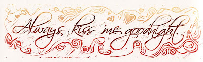
It's not a new sentiment, but if it ain't broke, don't fix it.

Naturally I didn't get things together in time to give us a big headstart on Valentine's Day (now just a week and a half away)... so here's the deal. Leave a comment on this post until midnight Thursday, February 9. I'll assign the comments a number in the order they are made and then use an online randomizer to pick a winner on Friday. If you're in the US, it might get to you by the 14th. But, hey... who wants to only celebrate the people they care about one day a year? After Valentine's Day is good, too.

I printed several of these in a variety of colors... you can see them in my Etsy store, Rio Salida Art. Where, as blog readers, you get the extra-special whammy of a coupon code good for 20% off anything in the shop through the end of the month! Just use the code THANKS20 at checkout. 'Cause you all are my valentines. Really. I've got a big, green gong to prove it.

UPDATE: It appears that Blogger might not be accepting comments in a timely manner today. We're also without cell service here in the Heart of the Rockies, so perhaps that solar flare is flaring. And the moon is almost full. Whatever. Don't despair if you can't comment. Try again later!

Wednesday, February 1, 2012

Studio Redux

Well.

You may recall that back in September I delightedly moved my printmaking operations to an out-of-house, dedicated studio. I really enjoyed having a space to go to that was entirely about making prints, but there were some less than ideal aspects to the situation. The first was that to get to Studio V required navigation of a long (26 steps and 2 landings) stairway, which meant I couldn't get things like my flat files up to the work space. (Presszilla* was out of the question.) Most of my reference books and sketchbooks and my drawing table also stayed home (where I continued to work on illustration projects)... so "poking around" developing new prints couldn't really happen at Studio V. I had to arrive at the studio with a plan, and once the plan was accomplished, head back home again. Finished prints had to be carried home to store... Not so efficient.

There were other details that weren't working out, either (let's just say the building didn't have the right vibe), so in the end I decided to bring everything back to the home studio. The challenge was to figure out how to integrate the new door-turned-workbench into the old space! After much headscratching and some judicious rearranging space was made and last week the workbench and Elvis came back home.


Things are pretty cramped in here, but I'm delighted to discover that the time spent working elsewhere help me develop a new system for working here. The priorities for this space have changed... An 80-inch-long workbench demands that the bulk of the room is now focused on printmaking, but there's still just enough space for illustration and design and the administrative tasks that have to be done here. I'd still like to have a dedicated studio that's not in the house, but it needs to be the right space. The greatest thing about the last few months in Studio V is that I learned more about what the right space should be.

I've already done some printing here, tweaking the space as I go. You can see in the image above that there's something big happening, but I'm not ready to share it just yet. I did pull a number of just-for-fun prints that I'll post later this week... There's a little celebration about to happen!


(*Presszilla still isn't here, but I think we've worked out a plan for her that will benefit more than just me. Details as they become available.)

Linocut in Progress: Color in a gray season

 Mud season came early to the midcoast this year. So. Much. Rain. Seemed like a great time to get started on a piece with a little more colo...