Tuesday, March 27, 2012

The Adventures of Use-Only-Five-Colors Woman!

When we last left our hero, she had embarked on a new reduction linocut. Her mission? Pick only five colors and stick with them.

As you may recall, the effort began like this:


The second color was also a blue, but Use-Only-Five-Colors Woman neglected to take a photo. In the end this second color turned out so much like the first that it almost doesn't count. Too late to turn back now, though.

Third color... light ochre.


Fourth color... a darker ochre.


As frequently happens at this point, consternation ensued. The first ochre looked green, not yellow, and the value seemed too dark. The two blues were almost indistinguishable. But Only-Use-Five-Colors Woman would not be defeated by mere ink on paper. She carved some more and then printed the fifth color.


Take THAT, wicked value changes! Ka-POW evil color temperature! Don't even THINK about messing with Use-Only-Five-Colors Woman!

Use-Only-Five-Colors Woman strikes a triumphant pose, her super apron waves gently in the breeze.

But wait! Who's this? Oh no! It's the nefarious Just-One-MORE-Color Woman! She's engaged Use-Only-Five-Colors Woman in some sort of devious wrestling match. Will our hero have to hang up her super-apron? Tune in next week for the exciting conclusion.

Monday, March 26, 2012

Exhibition News Update

It's been a tad chaotic here the last week or so... still stumbling along in Admin mode. I shipped some work off to a show, ticked the last of the current jury deadlines off my to-do list, and THEN... responses to the last batch of applications started to come in. So far everyone's saying YES! Eek!

First: I was accepted to the Crested Butte Arts Festival in August. I haven't ever participated in an art festival before, but some friends have been encouraging (read: arm-twisting) me to give it a try so I sent off an application. It's a nice show, exhibiting typically strong work and enjoying good crowds. I'm delighted with the acceptance, but a tad overwhelmed about the logistics of it all.

Then: Because of a little scheduling hiccup at the Paquette Gallery in Salida, my October show has been moved to MAY! Thankfully I've got plenty of work on hand at the moment, although you can bet my framer's not going to be happy with me this week.

And then, (drumroll please) the biggest news of all:
Way back in 1994, I was invited to participate in an art and conservation project in the Extremadura region of Spain. The project was the brainchild of the recently-launched, Netherlands-based, Artists for Nature Foundation (ANF), and through it I met remarkable international artists who have become not only respected colleagues but some of my dearest friends.

So here we are in 2012... and it's ANF's 20th anniversary! To celebrate, ANF will hold an exhibition and Jubilee weekend in De Bilt, Netherlands in May.... and I'm going to be there! The trip was not on my radar at all, but everything seemed to happen all at once and off I go. Can't. Wait.

Of course this means that I have to cram April AND May's tasks in to April... but it's a small price to pay to connect with an organization and people who mean so much to me. Sheesh. What am I doing dinking around online? Gotta get to work!

Friday, March 23, 2012

Fieldwork Friday: Mt. Ouray State Wildlife Area


This afternoon I wandered out to Mt. Ouray State Wildlife Area, just a couple of miles past town. The property was once an active fish hatchery, but that operation moved downriver long before I discovered this treasured spot. The old hatchery ponds still hold fish and there's plenty of access for anglers along the river, but for me the big draw is the wetland.

A ditch runs through the property all year long. It's quiet now, but before long the low areas will be flooded with water and the acres of cattails will be green and noisy with bird life.

In the middle of the property stands a small, abandoned, brick building. Well... perhaps stands is a generous word. Bricks have sagged and in many places are lost. Wood is rotted. Hinges are rusted. Most of the wooden roof shingles disappeared long ago. It feels as though it stands only because it doesn't have the energy to fall down. Indifference holds it in place.

I had never approached the building before... usually there's too much water and muck between it and my path. I had always assumed it was just some outbuilding of the old hatchery, but today I was able to pick my way across soft, not saturated, ground and discover that it was once a house.

The skeleton of three tiny rooms tentatively frames the inside. What's left of the floor is a riot of broken lath and crumbled plaster. A rusty old bed spring sighs in a corner– a broken sink suggests a kitchen.

I perched on a fallen tree to make a drawing of the door, and beyond the quiet I became aware of the trill of sandhill cranes high, high above. Eventually a group of forty or more came into (binocular-assisted) view... tiny gray specks calling across the blue. Did this building's former occupants also turn their faces to the sound on spring days as fine as this one?

When I finished my drawing and packed up my gear, I peeked into the house one more time. Up on an exposed ceiling beam I spotted a bird's nest.

Well, whaddaya know? Someone still calls this place home.

Sunday, March 18, 2012

Some weeks you print, some weeks you just do admin

Guess what kind of week I had. (Hint: It wasn't the kind that involved a baren.)

It's kind of nice to be able to tick things off one's "to-do" list, though. With two new prints drying and a couple of contract jobs awaiting feedback, this past week seemed like a good time to tackle several items on my bloated task list, particularly those with end-of-March deadlines. So I got some photography done, filled out and submitted some jury applications, organized files for an upcoming contract job, and worked on my sadly-neglected website. (I still need to sort out the galleries to reflect the work done in the past year, but it's getting there.)

One of these prints is not like the others....

Both of the recent pieces were dry enough to spread out on the floor and sort out how many would make the cut for the edition so I did that, too. It's always satisfying to see them all together.

By today I was ready to start something new, so here's the mysterious beginning of a linocut that, as promised, should will have only 5 color passes. Already I want 6... but I'm determined to try to meet this self-imposed challenge. I'm taking the opportunity to try a new mark-making technique or two, too. In this first pass I used a book-binding awl to "punch" small white dots in the block.


I'm also printing on Hosho paper that may or may not have the sizing issues that forced me to abandon its use. I've got a stack of it, so I need to find something to do with it. I'm hoping that keeping the number of ink passes low will avoid problems. We'll just have to see, won't we?

Sunday, March 11, 2012

I lied. NOW it's finished.

Okay, okay. I didn't mean to lie, but I sat with "Pas de Ducks" for a couple of days and something about it just didn't feel right. Maybe it's because it was the most subtle piece I'd ever done and although I admire subtlety in the work of others, I can't seem to get comfortable with it in my own work. The main part of the reflection needed to be another shade darker.

"Pas de Ducks," reduction linocut on Awagami Kozo paper, 8" x 12"

I didn't do any more carving, this transparent dark green went right over the top of the previous color.  I'm still going to call it 22 colors. Pretend the next-to-last color never happened. It can be our little secret.

Thursday, March 8, 2012

Pas de Ducks... the big finish

As usual, the process of finishing a reduction print slowed down as more layers of ink were applied and drying times increased. But I think we're finally there...

When we last left our feathered heros, the pattern of the water reflection was just getting established. Here's a little reminder, in case you forgot:

Color 17 (again)

This was, quite surprisingly, color 17 for the image. A new Sherrie record. Thankfully there aren't seventeen colors stacked up over the entire surface of the image, or I would have pulled my hair out long before now.

The next pass was another blue... (why not?)

Color 18, and hmmm... I think this was shot
in the evening under entirely artificial light, don't you?

And then... well... it's difficult to see in this shot and this light. My new 8-inch brayer was put to work applying a transparent gray that blended cool-to-warm from top to bottom. Just to keep things from looking too flat.

Color 19.

And then Color 20. AND Color 21. Yeah. It happened. Couldn't help it. The left side of the image, up to and a little bit around the ducks is one medium-dark gray. The upper right corner was inked a paler gray. The dark just got too busy when it was everywhere.

On the top, Colors 20 and 21.
You'll laugh out loud now when you read the words "I didn't want things to get out of control..." but I wanted a skosh (spelling?) more contrast in the darkest reflection. A little more carving and...

Color 22 and finished. I think.

I'm struggling to get a decent shot of this piece (I can never get the range of blues right, plus there's wet ink glare), but I think it's done. I've developed a bad habit of second-guessing myself lately... so it's time to step away and work on something else for a bit. I'll look at it again in a week or so and see how I feel about it.

Until then, I need to come up with an image I can produce in just five colors. Because for some reason there seems to be some skepticism about my ability to do so. I can't imagine why.

Wednesday, March 7, 2012

So close!

... but not quite finished. I had hoped to finish printing the duck linocut today, but the last round of color is still too tacky. I'm going to try to wrap things up tomorrow– I am really anxious to get this one settled.


In the meantime, I thought I'd share a look at what came in the mail this week. My year-and-a-half-old 4-inch Takach brayer (on the right) has a new sibling. Yeah, it's an EIGHT-inch Takach hand brayer. I had some good sales last month and I overpaid my estimated taxes, so I decided it was time to treat myself to another fine tool. I. Love. These. Brayers. Wide diameter for a longer roll-out length, beautifully surfaced rubber, sturdy construction. They take a bit of muscle to move (nice tricep workout), but they lay down a perfectly scrumptious layer of ink. And now I can achieve an 8"-wide blended roll in one pass. Happy.

Saturday, March 3, 2012

Mallard linocut - next steps

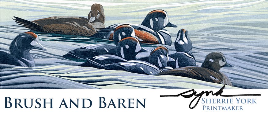
I realized after I posted the last series of photos that I kept talking about "the stencil" but I never showed it to you. Of course now I'm past the point where it's being used, but just to set the record straight, here 'tis.


Just as in the last piece, No Time Like the Present, I cut the silhouette of the ducks from a sheet of "medium" weight (.005 m) mylar. It's sturdy enough to be run over multiple times with a brayer, but not so thick that it causes a halo of ink. It can also be cleaned and reused, which was important for this piece.

Following on from the previous post, the stencil (of which acquaintance you now enjoy) was employed to apply a second, darker brown to the lino block for both the male and female ducks. (Colors 11 and 12.)

Two browns, colors 11 and 12.

And then printmaker documentation error occurred. The breast of the male and the upper back of the female received another layer of reddish-brown... but apparently I missed taking a photo. Sorry 'bout that.  (Color 13, absent without leave.)

At that point the female was finished, but there was one more pass for the male, a dark blue-black. (Last use of the stencil for inking, Color 14.) At this point I also printed the male's foot, which I accidentally missed earlier when I printed the female's foot. It's a slightly different orange, so technically I guess it's Color 15. Oh, my!

Blue-black and orange, colors 14 and 15. And a crummy photo.

And now the head-scratching phase. I have a great, complicated reference photo for the reflection of water off of the fishing dock at our nearby lake that I want to incorporate here. I love the graphic pattern of it, but the color in my reference is very blah and gray. Clearly we are looking over the edge of something for our view of this pair, so there must be some sort of lovely reflected sky... right?

I cleared the remaining bits of duck from the block and printed a light blue.

Light blue, color 16.
Much, much carving ensued, and then another blue.

Medium blue, color 17.

We're (ahem) treading uncharted waters after this. Not entirely sure where to go with the next color. I think there are only two left at this point... although if I come up with three that will make an even 20. Ridiculous, really... My next print is going to be 5 colors, max.

Thursday, March 1, 2012

Getting down to duck-ness

Okay, okay... I guess it's time to prove that I've been working away on a new reduction linocut. More waterfowl? Hmmm. I seem to be in a watery rut at the moment.

As a reminder, here was the first pass. Two colors, ink applied through a stencil to keep the color where I wanted it.

Yellow and yellow ochre

I carved a bit and then used the same stencil to apply the next two colors. You already know what species these are, doncha?

Light green, darker yellow ochre

A little more carving and then... you guessed it... I used the same stencil to apply the next three colors. I did, however, remove a tiny bit more of the stencil material (mylar) to accommodate the female duck's foot.

Another green, another pass of yellow ochre, and orange

By golly, there are already seven colors on this image! Time to get a little action started on the background. I put the stencil aside and after a bit more carving I applied a transparent gray over the entire block.

Transparent gray

Again a little bit of carving and back to the use of the stencil to apply two more browns. (Colors 9 and 10, if you can believe it.) The most exciting thing to me about this pass was that the transparent brown ink almost completely resolved the male's head without having to print a third green.

One darker brown each for the male and female.

Pretty good start, I think. I've moved on four more passes from here, but you don't really want me to show everything at once, do you? As you've no doubt surmised (being the clever readers you are), the overall image is wider than I've been showing with these shots of the bird detail. So far the birds have been where all the action is, but that will change shortly! Stay tuned.

Linocut in Progress: Color in a gray season

 Mud season came early to the midcoast this year. So. Much. Rain. Seemed like a great time to get started on a piece with a little more colo...