 |
| Step 8 |
I guess this step shows some obvious change from Step 7 in the previous post. At this point I was trying to deepen the value change from top to bottom without going too far, too contrast-y. This was a pale blue to deep blue blend. All very transparent, of course.
 |
| Step 8 blend. |
Looking okay, but I wanted more depth of color... so no small amount of carving later I printed this.
 |
| Step 9 |
Why, yes. It was another blue-to-blue blend. However did you guess?
But it still wasn't feeling quite rich enough.... so....
 |
| Step 10 |
Surprise! Another blue-to-blue blend, although these inks had some black added all the way through. It's hard to tell from these small images... the easiest place to see the differences is in the bottom third.
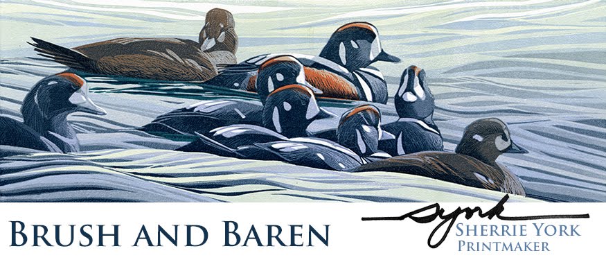
So all that was left were the darkest bits of the sleeping birds.
 |
| "Wild Dreams" reduction linocut, Step 11, final. At least I think that's the title. This one is embiggenable with a click. |
Now here's the rub. Since it took me a while to figure out how to work with the extra-large inking roller, several of the prints had first layers that were too light. I kept them in the rotation and printed them along with all the others. As a result, I have two slightly different versions of the same image. Here's the other one.
 |
| "Wild Dreams" linocut, alternate version. Also embiggenable. |


Bravo! It's gorgeous! That's a lot of splendid carving, and mixed color rolling and mind-bending planning. Hats off to you!
ReplyDeletevery nice finish :)
ReplyDeletehmm I think I prefer the darker of the 2, more blue to it helps give it a watery look :) either way its gorgeous :)
Both prints are very nice. If I had not seen them together I would not have questioned either one. Since you asked for a favorite, I prefer the lighter one because there is a little more sense of depth from front to back, but I do with the dark on the birds was just slightly darker on that print. Beautifully done and so enjoy reading about your process.
ReplyDeleteWOW! Stunning indeed. I truly love the darker one just a tad better, but that's just me!
ReplyDeleteWow indeed! Great water work, and I love those sleeping birds. I have to vote for door number one (the darker of the two) because the color values are just so gorgeous.
ReplyDelete